Aligning Text in LibreOffice Writer
Ducks in a Row

© synell, 123RF.com
To get professional publishing results, here are a few tips and tricks to get the most out of LibreOffice Writer’s alignment options.
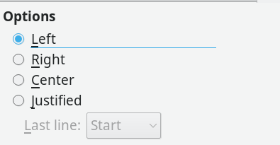
Just because an option in LibreOffice Writer is easy to choose does not mean that it is easy to use. Take, for example, alignment, or how characters are arranged between the left and the right margin on a line. A single click on the Alignment tab of a paragraph style will set the alignment to right, center, left (ragged right), or justified (i.e., evenly distributed between the margins). Yet to use any alignment takes design knowledge and, sometimes, extra effort as well (Figure 1).
Right Alignment
Aligning letters to the right margin is used the least. Right alignment is used only in layout, such as a title page. A basic rule of layout is that related information, such as the lines of a mailing address should have a common alignment. For instance, an address on a letter is traditionally right aligned. You often find a right alignment on a brochure or diagram as well. Generally, though, only a few lines in a document are likely to have a right alignment, for the simple reason that most European languages read from left to right, and an uneven left margin is harder to read and just looks wrong to most people.
[...]
Buy Linux Magazine
US / Canada
UK / Australia
Subscribe to our Linux Newsletters
Find Linux and Open Source Jobs
Subscribe to our ADMIN Newsletters
Support Our Work
Linux Magazine content is made possible with support from readers like you. Please consider contributing when you’ve found an article to be beneficial.

News
-
Gnome’s Dash to Panel Extension Gets a Massive Update
If you're a fan of the Gnome Dash to Panel extension, you'll be thrilled to hear that a new version has been released with a dock mode.
-
Blender App Makes it to the Big Screen
The animated film "Flow" won the Oscar for Best Animated Feature at the 97th Academy Awards held on March 2, 2025 and Blender was a part of it.
-
Linux Mint Retools the Cinnamon App Launcher
The developers of Linux Mint are working on an improved Cinnamon App Launcher with a better, more accessible UI.
-
New Linux Tool for Security Issues
Seal Security is launching a new solution to automate fixing Linux vulnerabilities.
-
Ubuntu 25.04 Coming Soon
Ubuntu 25.04 (Plucky Puffin) has been given an April release date with many notable updates.
-
Gnome Developers Consider Dropping RPM Support
In a move that might shock a lot of users, the Gnome development team has proposed the idea of going straight up Flatpak.
-
openSUSE Tumbleweed Ditches AppArmor for SELinux
If you're an openSUSE Tumbleweed user, you can expect a major change to the distribution.
-
Plasma 6.3 Now Available
Plasma desktop v6.3 has a couple of pretty nifty tricks up its sleeve.
-
LibreOffice 25.2 Has Arrived
If you've been hoping for a release that offers more UI customizations, you're in for a treat.
-
TuxCare Has a Big AlmaLinux 9 Announcement in Store
TuxCare announced it has successfully completed a Security Technical Implementation Guide for AlmaLinux OS 9.